 |
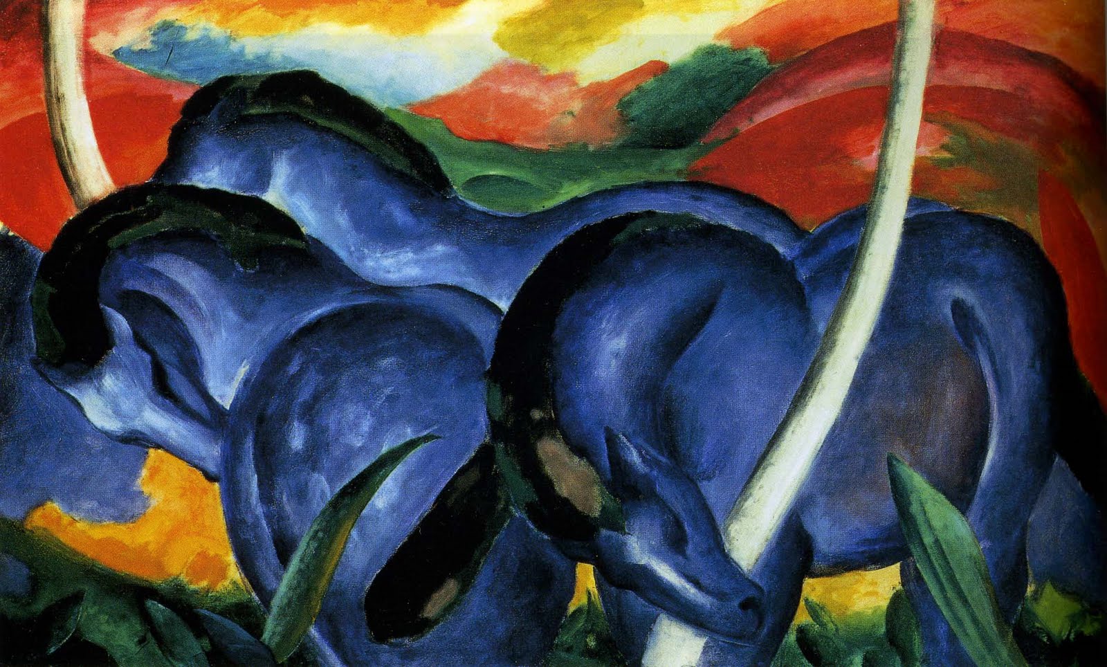
| Franz Marc, Large Blue Horses |
If you interpret tranquility as lots of reds, blacks, and yellows, I can't really disagree, but I will send you to the school nurse.I do actually have strong comforting associations with red -- strong enough that it would make sense for me to include them in the color palette of a room in which I wanted to feel tranquil. Note also, that the reds and yellows give the painting above a sense of voluptuous abundance, while the symmetrical composition gives it stability. This abundance and stability provide the perfect setting in which the blue horses can rest tranquilly. Or, at least, I see it that way. However the assignment was to communicate beyond the confines of my skull, so I sidestepped the issue by not illustrating tranquility.
My color associations slip over the borders into synesthesia sometimes. Many, maybe all, scents and tastes have color. My favorite perfumes smell golden brown and purple. Lavender is silver. Eggs are various shades of beige. I don't like things that taste too beige, unless there is a strong flavor to balance all that mute beige. Lemon, a bright robin's egg blue, goes with almost everything. Caraway is a bright springy green, but too bright a yellow green is the color of a headache. I don't like things that taste like headaches. Chartreuse' actual color matches the color I associate with the flavor, which should give a nice consistency to the experience, except that it is exactly the color of a migraine.
And that's just foods and smells. There is another layer of meaning, color and emotion go together. Red for joy, protection, comfort. Dark blue for grief*. Pink for aggression (positive or negative). Pale yellow for epiphanies, apprehension of beauty, and power. Bright yellow green is almost always negative: deceitful, hallucinatory, painful. Sometimes. But other people don't see color in the same way. So I try to take into account the commonly agreed on cultural connotations of color. Or at least not say things like "purple is the color of stability so I chose to use it to anchor this design, as it plays off against the teal of secret growth, and the manic yellow green." Johannes Itten, the father of color theory, tried to make such personal associations universal. For example, according to him purple was an ominous, threatening color. That aspect of his work has not aged well, even as his principles for understanding color schemes continue to be taught.
*Blue is a funny one actually. My brain tends not to classify many shades of blue as color, but rather as shades of grey with pretensions. I discovered this in final presentations when someone complimented a student on his colorful composition which took me a moment to understand, because the colors in question were mostly blue.
A sense of voluptuous abundance is a delightful way to describe the above painting. The abundance so obscured my vision that in my first viewing I did not see the blue as horses but rather as big delicious flowers.
ReplyDeleteI enjoy the way you use color in your own work to impart moods and feelings. You can be both subtle and direct at the same time.
Nancy